The HealthyR Advent Calendar 2022 was a series of 24 R tips I shared on Twitter last December It is based on “R for Health Data Science” by Harrison and Pius. Use JKL20 for 20% off, including free worldwide shipping. Here’s a selection of the most popular ones, all 24 can be fount at this website: https://healthyradvent.netlify.app/ More information about HealthyR, including the book and freely available resources can be found at: https://healthyr.

Continue reading

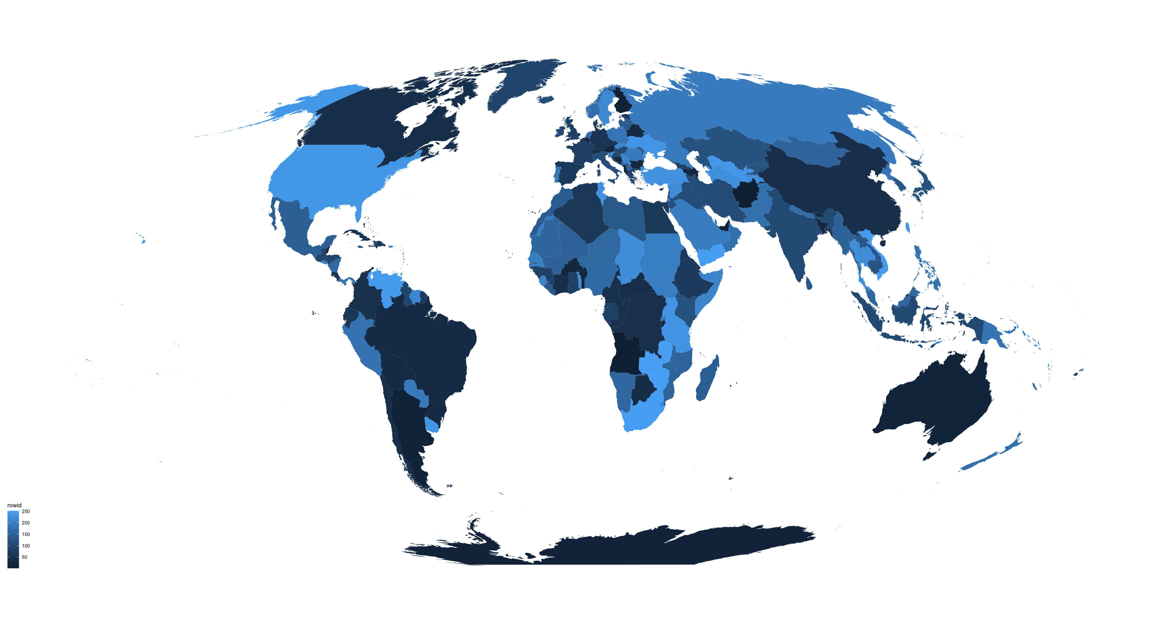
There are several different ways to make maps in R, and I always have to look it up and figure this out again from previous examples that I’ve used. Today I had another look at what’s currently possible and what’s an easy way of making a world map in ggplot2 that doesn’t require fetching data from various places. TLDR: Copy this code to plot a world map using the tidyverse:

Continue reading

I’ve recently started using ggplot2 in addition to lattice (see this post that I made a while ago, explaining how I got into using lattice in the first place). Hint: when using ggplot2, you’ll need to use of the reshape2 package (also written by the amazing Hadley Wickham) to get your data into a form that ggplot2 works best with. Another thing that you’ll want to think about when using ggplo2 is factor levels.

Continue reading

Author's picture

Riinu Pius (Ots)

if it aint broke, you’re outdated

Senior Data Manager

Edinburgh, UK